Cyber Risk Quantification: Measuring Cyber Exposure in Rupees (IIBF RFS)
Cyber risk quantification turns a vague red-amber-green heat map into a number your CFO can actually plan around. For years, banks rated cyber risk as High, Medium, or Low on a coloured grid. That felt intuitive. It never told anyone how much rupee capital was really at stake. IIBF's Risk in Financial Services (RFS) paper now expects you to explain how frequency and severity distributions, scenario analysis, and Monte Carlo aggregation replace colour codes with a rupee loss estimate. This article walks through that shift. It ties the method to cyber insurance limits and shows what a board should actually see.
🔥 Why Heat Maps Fall Short
A heat map plots likelihood against impact on a grid. Each cell gets a colour. Red means act now. Green means relax. The method is fast and easy to explain in a committee meeting.
The problem is what the colour hides. Two "Red" risks can differ by ten times in rupee terms. A heat map cannot say which one deserves the bigger budget. It cannot be added, averaged, or compared across business lines. You cannot buy insurance against a colour.
Regulators and boards increasingly ask a sharper question: how much money is at risk this year, and how much in a bad year? A heat map has no answer. Cyber risk quantification exists to close that exact gap, by expressing exposure the same way you already express credit or market exposure — in rupees, with a range.
⚠️ Common Mistake: Candidates describe heat maps as "risk quantification". A heat map is a qualitative rating tool. Quantification means a rupee-denominated loss estimate with a stated confidence level.
📐 Frequency, Severity and the Loss Distribution
Cyber risk quantification starts by splitting each loss scenario into two questions. How often does this type of event happen? And how bad is it when it does? The first question builds a frequency distribution. The second builds a severity distribution.
Frequency comes from internal incident logs, industry threat intelligence, and expert judgement where data is thin. Severity comes from past incident costs: forensic investigation, customer notification, regulatory penalty, business downtime, and reputational spend on remediation. Neither number needs to be exact. Both need to be defensible ranges, not single-point guesses.
This is the same discipline your bank already applies to credit exposure. The logic behind credit risk models and the broader approach to measurement of credit risk both convert a qualitative worry into a distribution of possible outcomes. Cyber risk simply borrows the same toolkit and points it at a different loss driver.
Once you have frequency and severity, you combine them into an aggregate annual loss distribution. This is not one number. It is a curve showing every possible total loss for the year, and how likely each level is.
💡 Exam Tip: If a question asks you to name the two building blocks of loss modelling, the answer is always frequency and severity — never "probability and impact" alone.
🎲 Scenario-Driven Estimates and Monte Carlo Aggregation
Real portfolios rarely have enough internal cyber-loss history to build a clean statistical model. So quantification teams lean on scenario analysis. Subject matter experts describe specific event types — a ransomware attack, a third-party data breach, a core-banking outage — and estimate plausible frequency and severity ranges for each.
Here is a simple worked example using round numbers. Assume your scenario catalogue estimates 4 significant cyber loss events per year on average. Each event carries an average severity of Rs 25,00,000, covering incident response, customer notification, and regulatory cost.
Multiply frequency by average severity: 4 events x Rs 25,00,000 = Rs 1,00,00,000 expected annual loss. That single figure is the loss expectancy. It is useful, but it hides the bad years.
Monte Carlo aggregation solves that. The model runs the scenario thousands of times, letting frequency and severity vary randomly within their estimated ranges each run. Some simulated years show zero events. Others show three severe events landing together.
The output is a full distribution, not one average. A 95th percentile result — the loss level exceeded only 5 percent of the time — might come out near Rs 3,00,00,000 in this example. That tail number, not the average, is what should drive your capital buffer and your insurance conversation.
FAIR-style factor decomposition follows the same logic in more granular form. It breaks each scenario into threat event frequency, vulnerability, and loss magnitude factors, then aggregates them the same way. The output format stays identical: a rupee distribution, not a colour.
🛡️ Cyber Insurance Limits and Key Risk Indicators
Once you have a loss distribution, cyber insurance stops being a guess. The tail of the distribution — the 95th or 99th percentile loss — tells you the cover limit you actually need. Buying insurance against only the average loss leaves the bank exposed in exactly the year it needs the policy most.
Quantification also disciplines premium negotiation. If your modelled tail loss is Rs 3,00,00,000 and your policy caps payout at Rs 1,00,00,000, the gap is a board-level decision, not a surprise after a breach. This mirrors the discipline built into model risk management in banks, where every model output carries a stated confidence band rather than a false sense of certainty.
Key risk indicators (KRIs) sit alongside the loss model as early-warning signals. Useful cyber KRIs include patch-deployment lag on critical systems, the phishing simulation click-rate, the count of dormant privileged accounts, and spikes in failed login attempts. None of these are loss numbers by themselves. Each one is a leading signal that frequency or severity may be drifting upward.
Good practice ties KRI thresholds back into the loss model. A rising phishing click-rate should nudge up the assumed frequency of a credential-theft scenario at the next model refresh. This keeps the quantification current instead of static.
Banks also anchor their control expectations to RBI's cyber security framework for banks, which sets baseline expectations on governance, incident reporting, and board oversight of cyber risk. Quantification does not replace that framework. It gives the framework a rupee scale.
📋 What the Board Should Actually See
A board pack built around cyber risk quantification looks very different from a heat-map slide. It shows expected annual loss, a tail scenario in rupees, the trend in key KRIs over the last few quarters, and how current insurance cover compares with the modelled tail.
The table below contrasts the two reporting styles directly.
| Dimension | Heat-Map (RAG) Rating | Quantified Loss Modelling |
|---|---|---|
| Output format | Colour label (Red / Amber / Green) | Rupee loss range, expected and tail |
| Comparable across risk types | ❌ No — subjective per assessor | ✅ Yes — common rupee scale |
| Supports insurance limit setting | ❌ No direct link to cover amount | ✅ Tail loss maps to cover needed |
| Board decision usefulness | Limited — a label without a number | High — trade-offs stated in rupees |
| Direction of regulatory expectation | Legacy starting point | ✅ Increasingly the expected standard |
Notice the parallel with how boards already receive market risk measurement in banks. Nobody reports market risk as a colour anymore; VaR and capital charge numbers replaced that years ago. Cyber risk is simply catching up to the same reporting standard.
A quantification-led board pack also strengthens the bank's overall risk culture in banks, because directors can ask precise questions instead of accepting a vague "high risk" label at face value.
✅ Conclusion: Make Cyber Risk Speak Rupees
Cyber risk quantification is not a replacement for good cyber hygiene. It is the language that lets a board weigh cyber spend against every other risk on its balance sheet, including strategic risk in financial services. Once cyber exposure is stated in rupees, it competes fairly for budget, insurance cover, and board attention.
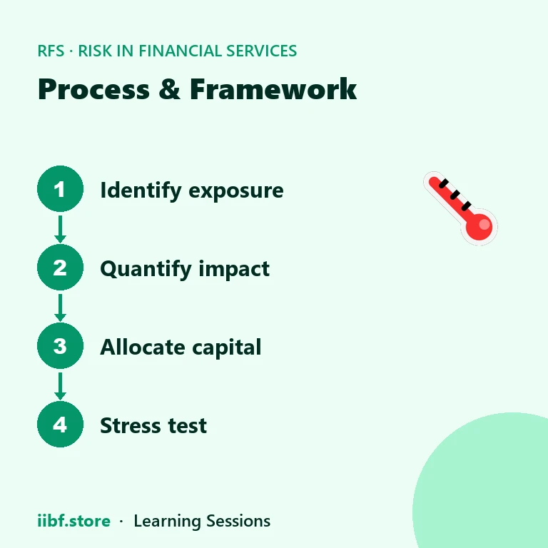
For the exam, remember the chain: frequency and severity build the loss distribution, scenarios and Monte Carlo aggregation produce the tail, and KRIs keep the whole model current. Explore more chapter guides on the risk in financial services tag hub to connect this topic with credit and market risk quantification.
Ready to test yourself? Start your CAIIB RFS preparation and move from theory to exam-ready recall.
🧠 Practice MCQs: Cyber Risk Quantification
Q1. What are the two core building blocks of a cyber loss model? (a) Likelihood and impact colour codes (b) Frequency and severity distributions (c) Capital and liquidity ratios (d) Threat actor and motive only
Answer: (b) — Frequency (how often) and severity (how much) combine to build the aggregate loss distribution.
Q2. A bank estimates 4 cyber loss events a year at an average severity of Rs 25,00,000 each. What is the expected annual loss? (a) Rs 25,00,000 (b) Rs 50,00,000 (c) Rs 1,00,00,000 (d) Rs 4,00,00,000
Answer: (c) — Frequency x severity: 4 x Rs 25,00,000 = Rs 1,00,00,000.
Q3. Why is a 95th percentile tail loss more useful than the average loss for setting cyber insurance limits? (a) It is always a smaller number (b) It reflects the bad-year outcome insurance is meant to cover (c) Regulators only accept averages (d) It removes the need for KRIs
Answer: (b) — Insurance exists for adverse years, so cover should match the tail, not the average.
Q4. Which of these is a key risk indicator (KRI) rather than a loss figure? (a) Expected annual loss (b) Phishing simulation click-rate (c) Insurance payout cap (d) 95th percentile tail loss
Answer: (b) — A KRI is a leading, non-monetary signal that frequency or severity may be drifting.
Q5. What is the main weakness of a red-amber-green heat map for cyber risk? (a) It is too detailed for a board (b) It cannot be expressed in rupees or compared across risk types (c) It requires Monte Carlo simulation (d) It is only used for market risk
Answer: (b) — A colour label is not comparable across risks and gives no rupee figure for insurance or capital decisions.
Want chapter-wise mock tests with 100+ MCQs? Start practising free →
What is cyber risk quantification in simple terms?
It is the practice of expressing cyber exposure as a rupee loss range, using frequency and severity data, instead of a red-amber-green colour rating.
How is loss expectancy calculated?
Loss expectancy equals frequency multiplied by average severity. For example, 4 events a year at Rs 25,00,000 each gives an expected annual loss of Rs 1,00,00,000.
Why use Monte Carlo simulation instead of just the average loss?
Monte Carlo simulation runs the scenario many times with varying inputs, producing a full loss distribution. This reveals tail outcomes that a single average figure hides.
How does cyber risk quantification help with insurance decisions?
It sizes the policy against the modelled tail loss, so cover matches the bad-year scenario rather than an average that understates real exposure.
Practice this topic
Take a free mock test, download chapter PDFs, or watch a video class — all included on iibf.store.
Keep reading